The Bushel
Design System
The Bushel
Design System
I led a system that unified 3 major products, reduced design debt, and helped teams ship with clarity and consistency.


Design Systems
Cross-Platform UI
Figma Libraries
Overview
Bushel’s design teams were working in silos. Every product had its own patterns, styles, and accessibility gaps. Engineers rebuilt common UI from scratch. Designers repeated the same work in slightly different ways. It slowed us down, hurt consistency, and made onboarding harder.
I led the creation and rollout of a cross-platform design system that brought everything into alignment. We built shared libraries, defined semantic tokens, audited accessibility, and created a flexible system used by Wallet, Mobile, and Farm to support new launches and shared experiences.
MY ROLE
Design System Lead
TEAMMATES
Designers, researchers, engineers
TOOLS
Design: Figma, Illustrator, After Effects
Dev & Docs: Storybook, Jira, Confluence
Testing: Stark, Useberry
Collaboration: Slack, Zoom
Impact
QA design review cycles dropped from 2 rounds to 1 on average
Design iteration time improved by 25% from wireframe to hi-fi
WCAG AA compliant components rolled out across 3 products
Enabled faster cross-product launches, including Bushel Payments, Farm Contracts, and ERP integration
Documented components and tokens in Storybook for real-world use, not just theoretical best practices
From Outdated Agtech to a Modern Design Foundation
When I joined the team, Bushel Mobile still ran on a legacy white-label app with hard-coded styles, poor accessibility, and fragmented UX. Each team reused outdated patterns and solved similar UI problems in isolation, which slowed delivery and made our product ecosystem feel disconnected.
I led the effort to replace that experience with a scalable design system that supported every product team. This wasn’t just a visual upgrade. It unified how we built, making the interface easier to use, easier to maintain, and easier to scale.

Before

After
How I Prioritized What to Fix First
I worked with design leads across teams to prioritize parts of the design system, starting with the friction points that slowed teams down most.
Forms were inconsistent, button states varied, and navigation logic changed between products. We prioritized patterns that could unblock active work, like input fields and button variants, while planning ahead for more complex components like tables.
At the same time, we aligned on typography, color, and illustration styles to support a company-wide rebrand. These decisions shaped both the structure and the visual language of the system.
Buttons
Do we need a secondary ghost button? appears in design but has no variant
TAGS
Check tags for potential usability problems when combined with filters
NAVIGATION
Top nav search should be updated to the new input component
Chakra UI
dev approved foundation. Quick to implement, flexible to customize.
PROGRESS BAR
Do we need to distinguish a progress bar for data vs for loading progress?
INPUTS
Let's consider increasing type size for form inputs
NAVIGATION/
SEARCH
Advanced search needs to be adapted to align with the design system
NAVIGATION/
SEARCH
Advanced search needs to be adapted to align with the design system
SELECT
Do select forms need a "clear field" button
Establishing the Style Guide
We built the style guide to support a growing design team working across four products during an active rebrand. Every decision around spacing, type, color, icons, and illustration was made to balance flexibility with consistency. The goal was to reduce design overhead and give teams a shared foundation without slowing down product work.
Spacing and Grids
We used an 8-point grid with spacing tokens for layout, nav, and modals. Designers had flexibility inside those rules, which supported product-specific layouts without breaking system consistency.
Spacing and Grids
We used an 8-point grid with spacing tokens for layout, nav, and modals. Designers had flexibility inside those rules, which supported product-specific layouts without breaking system consistency.
Spacing and Grids
We used an 8-point grid with spacing tokens for layout, nav, and modals. Designers had flexibility inside those rules, which supported product-specific layouts without breaking system consistency.
Abc
Abc
123
Typography
Our variable type system used Montserrat for headers, Roboto Flex for body, and Roboto Mono for data. These variables let us scale styles across breakpoints and gradually bring Bushel Farm into the shared system without disrupting their UI.
Abc
Abc
123
Typography
Our variable type system used Montserrat for headers, Roboto Flex for body, and Roboto Mono for data. These variables let us scale styles across breakpoints and gradually bring Bushel Farm into the shared system without disrupting their UI.
Abc
Abc
123
Typography
Our variable type system used Montserrat for headers, Roboto Flex for body, and Roboto Mono for data. These variables let us scale styles across breakpoints and gradually bring Bushel Farm into the shared system without disrupting their UI.
bg/action/default
#4990E2
bg/action/default
#4990E2
bg/action/default
#4990E2
text/default/default
#2D3748
text/default/default
#2D3748
text/default/default
#2D3748
bg/success/default
#2F855A
bg/success/default
#2F855A
bg/success/default
#2F855A
Color Palette
We based the palette on Chakra UI and mapped colors to semantic roles like bg/default, text/secondary, and bg/action/default. This made theming consistent and allowed updates without redesigning each product. We replaced Bushel Yellow due to accessibility issues and adopted Bushel Navy as our neutral.

Systematizing Icons
We standardized on Ionicons, removed what we didn’t need, and added custom icons for ag and fintech use cases. The goal was clarity and consistency, not volume.


Illustrations
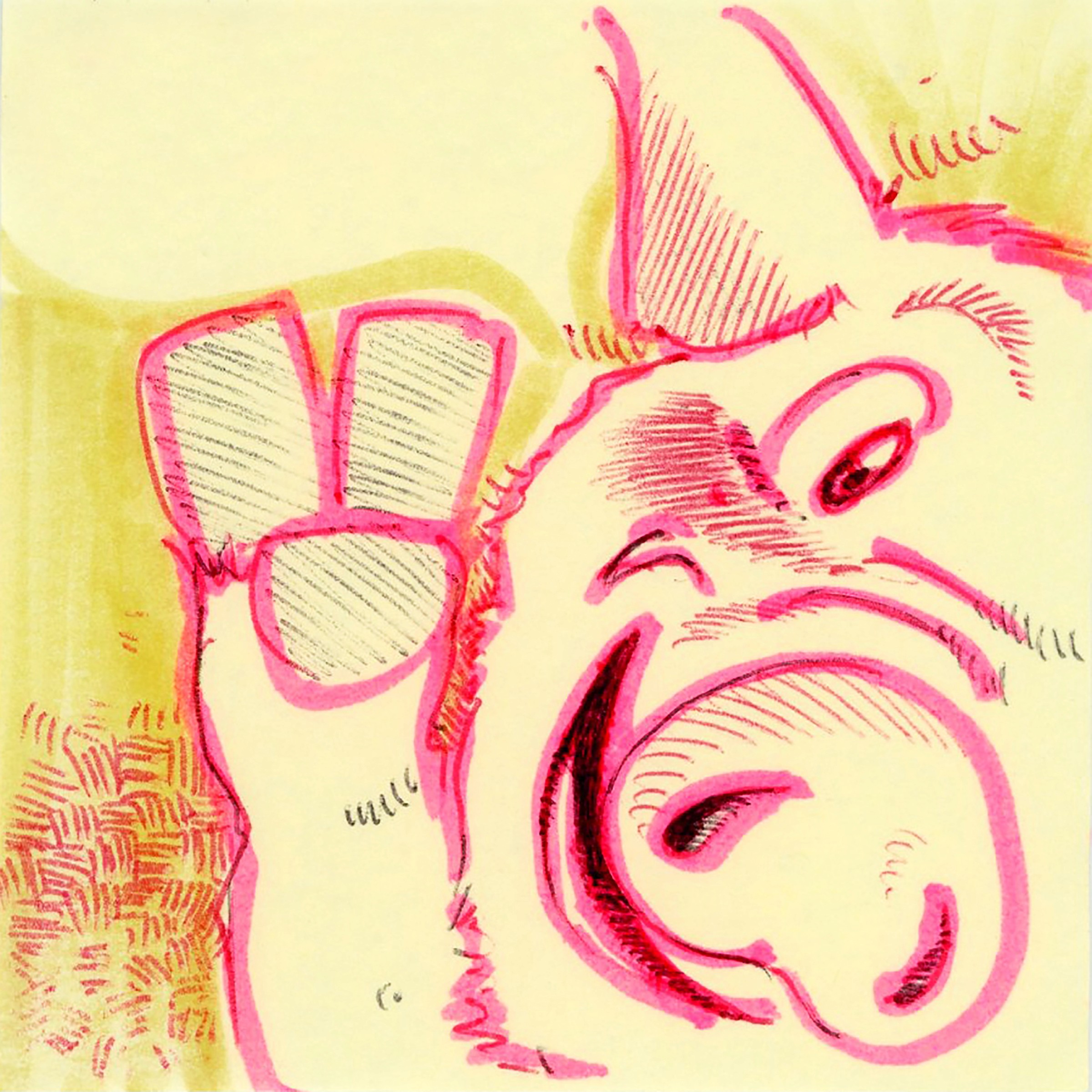
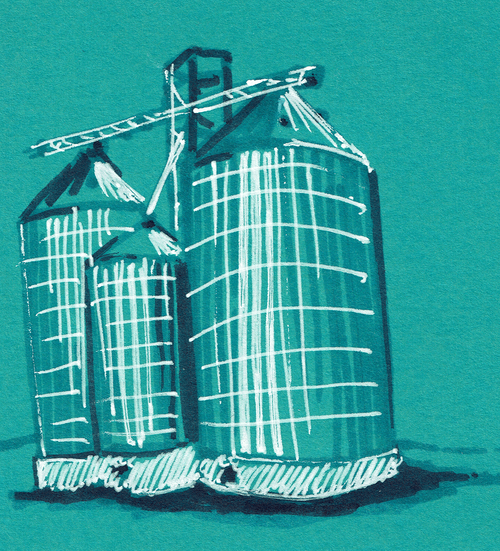
Our illustration style was inspired by a PM who sketched on sticky notes around the office. We turned that into a visual system with clear usage guidelines, bold line work, and a process for contribution. It reflected Bushel’s culture without relying on stock imagery.
Illustrations
Our illustration style was inspired by a PM who sketched on sticky notes around the office. We turned that into a visual system with clear usage guidelines, bold line work, and a process for contribution. It reflected Bushel’s culture without relying on stock imagery.
Illustrations
Our illustration style was inspired by a PM who sketched on sticky notes around the office. We turned that into a visual system with clear usage guidelines, bold line work, and a process for contribution. It reflected Bushel’s culture without relying on stock imagery.
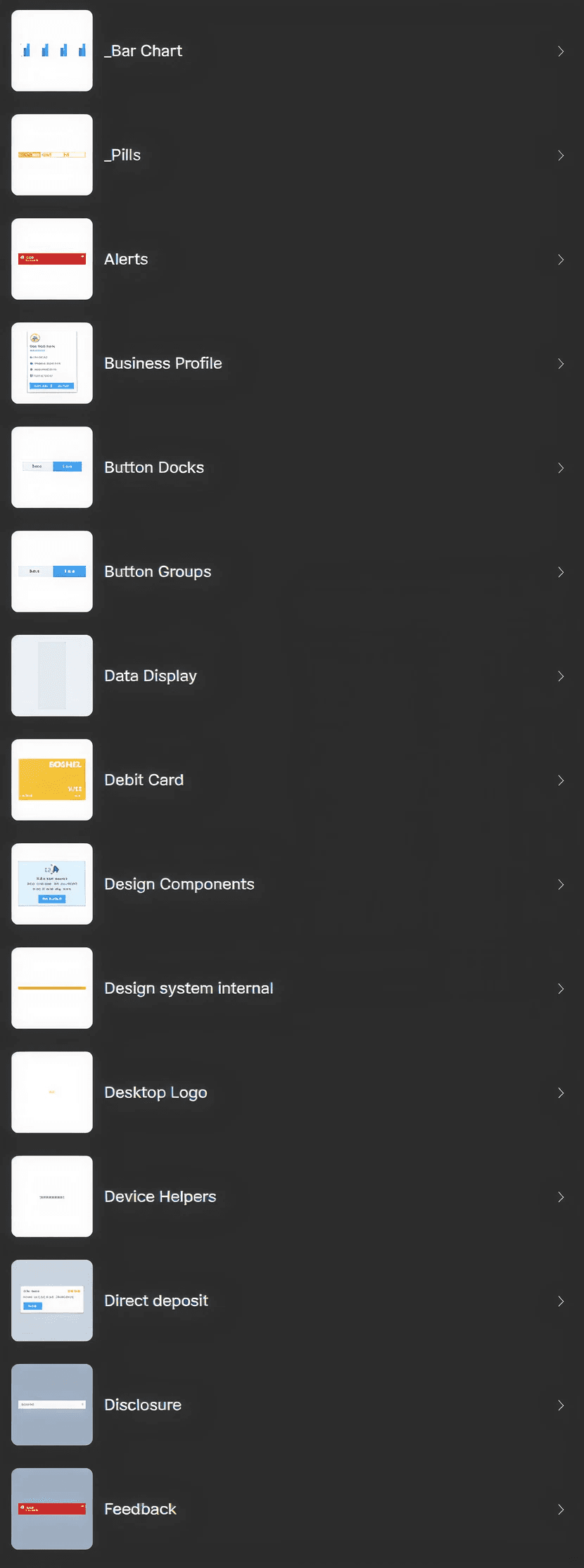
Design and Documentation
I led the design and structure of the component library from the ground up. This wasn’t a UI showcase. It was a flexible system that supported product work across four teams. I focused on building fast, scalable components that could handle real-world constraints without bloat.
Every component in the system was built to be scalable, consistent, and fast to use. We used Auto Layout, Variants, and nested structures to support real interaction states, screen responsiveness, and customization, without making things feel bloated or overly complex. The way we built things was just as important as what we built.
Modal Title
Swap Me!
Button
Button
Modal Title
Swap Me!
Button
Button
Modal Title
Swap Me!
Button
Button
Component Architecture
We prioritized high-traffic components like tables, forms, buttons, and navigation. I structured them using nested parts so designers could adjust flows without detaching from the system. Every layout supported real interaction states, responsiveness, and customization. This gave teams flexibility without compromising consistency.

Scaling Complex Components
Some components needed more than variants. Tables were especially complex, with different filters, actions, and row structures across teams. I created multiple levels of reuse: base layouts for simple needs, fully composed tables for high-traffic views, and smaller modular parts that designers could combine when requirements were more specific. This let teams solve detailed problems while staying aligned with the system.

Design Guidance
I embedded usage documentation directly in the Figma library. Designers saw expected states, behaviors, and layout rules where they worked, no switching tools or duplicating docs. This reduced onboarding time, cut back-and-forth, and made contributions easier to manage at scale.


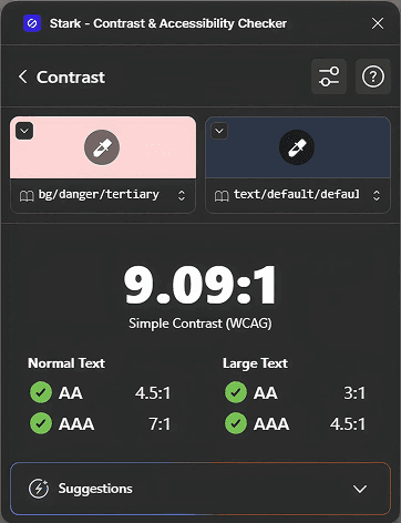

Accessibility Audits
We used Stark to run full audits across the library. I updated token values for text and borders to meet WCAG AA standards. Because the system used semantic variables, fixes rolled out across every product with minimal rework. This eliminated contrast issues at the root without slowing teams down.
Storybook Updates
11-12am
Weekly on Wednesday


Design System Working Session
2-3pm
Weekly on Monday
Working Across Teams
I ran weekly design system sessions with designers and engineers from Wallet, Mobile, and Farm. These were open to anyone and focused on sharing updates, resolving edge cases, and shaping the system together. We also set aside time after major Figma announcements, like the ones shared at Config, to decide how new features would affect our components and workflows.
I treated the system as a service, not a finished product. If someone needed a variant or ran into confusion, we worked through it and documented the outcome. That mindset helped build trust, reduced friction, and kept momentum across teams.
Config Watch Party
10-11am
Thursday
Onboarding Review
3-3:30pm
Weekly on Thursday
Implementation and Adoption
We embedded the design system into every product file from the start. The Figma library was kept up to date weekly, with new components added based on feedback from Wallet, Mobile, Farm, and Fulfillment teams. Designers never had to ask how to access the system. It was already in place and ready to use.
Storybook adoption moved slower because of engineering bandwidth, so we tracked implementation through a shared Jira board. Frontend engineers contributed directly as they built product features, which helped keep the system grounded in real use.
The focus was speed to value. Designers could start building right away. Engineers had access to accurate states. And updates were driven by actual team needs, not a detached roadmap.


Results
By the end of the rollout, the system was used across Wallet, Mobile, and Farm. It helped designers move faster, gave engineers a clear structure, and allowed us to ship shared experiences with confidence.

Speed & Scaling
Improved design iteration speed by 25%. Helped teams move from wireframes to high-fidelity faster.
Speed & Scaling
Improved design iteration speed by 25%. Helped teams move from wireframes to high-fidelity faster.
Speed & Scaling
Improved design iteration speed by 25%. Helped teams move from wireframes to high-fidelity faster.


Accessibility
Every product hit WCAG AA compliance. Reduced support risk, rework, and visual inconsistency across the suite.
Accessibility
Every product hit WCAG AA compliance. Reduced support risk, rework, and visual inconsistency across the suite.
Accessibility
Every product hit WCAG AA compliance. Reduced support risk, rework, and visual inconsistency across the suite.


Product Impact
Reused components powered launches like Bushel Payments and ERP linking. Teams shipped faster with less duplication.
Product Impact
Reused components powered launches like Bushel Payments and ERP linking. Teams shipped faster with less duplication.
Product Impact
Reused components powered launches like Bushel Payments and ERP linking. Teams shipped faster with less duplication.
Reusability
Flexible components supported different product needs without branching the system. Wallet, Mobile, and Farm all used the same foundation.
Reusability
Flexible components supported different product needs without branching the system. Wallet, Mobile, and Farm all used the same foundation.
Reusability
Flexible components supported different product needs without branching the system. Wallet, Mobile, and Farm all used the same foundation.
Reflection
This project reshaped how I think about design systems. I stopped seeing consistency as the goal. It became the outcome of supporting teams with the tools they needed to move faster and with more confidence.
I stepped into leadership by solving real problems. I helped shape decisions across teams, supported junior designers, and turned feedback into shared standards. What started as fixing patterns became a shift in how our team worked. The mindset of treating design as a way to serve my team is something I bring to every project.
The Bushel
Design System
The Bushel
Design System
I led a system that unified 3 major products, reduced design debt, and helped teams ship with clarity and consistency.
Design Systems
Cross-Platform UI
Figma Libraries
Overview
Bushel’s design teams were working in silos. Every product had its own patterns, styles, and accessibility gaps. Engineers rebuilt common UI from scratch. Designers repeated the same work in slightly different ways. It slowed us down, hurt consistency, and made onboarding harder.
I led the creation and rollout of a cross-platform design system that brought everything into alignment. We built shared libraries, defined semantic tokens, audited accessibility, and created a flexible system used by Wallet, Mobile, and Farm to support new launches and shared experiences.
MY ROLE
Design System Lead
TEAMMATES
Designers, researchers, engineers
TOOLS
Design: Figma, Illustrator, After Effects
Dev & Docs: Storybook, Jira, Confluence
Testing: Stark, Useberry
Collaboration: Slack, Zoom
Impact
QA design review cycles dropped from 2 rounds to 1 on average
Design iteration time improved by 25% from wireframe to hi-fi
WCAG AA compliant components rolled out across 3 products
Enabled faster cross-product launches, including Bushel Payments, Farm Contracts, and ERP integration
Documented components and tokens in Storybook for real-world use, not just theoretical best practices
From Outdated Agtech to a Modern Design Foundation
When I joined the team, Bushel Mobile still ran on a legacy white-label app with hard-coded styles, poor accessibility, and fragmented UX. Each team reused outdated patterns and solved similar UI problems in isolation, which slowed delivery and made our product ecosystem feel disconnected.
I led the effort to replace that experience with a scalable design system that supported every product team. This wasn’t just a visual upgrade. It unified how we built, making the interface easier to use, easier to maintain, and easier to scale.
Before
After
How I Prioritized What to Fix First
I worked with design leads across teams to prioritize parts of the design system, starting with the friction points that slowed teams down most.
Forms were inconsistent, button states varied, and navigation logic changed between products. We prioritized patterns that could unblock active work, like input fields and button variants, while planning ahead for more complex components like tables.
At the same time, we aligned on typography, color, and illustration styles to support a company-wide rebrand. These decisions shaped both the structure and the visual language of the system.
Buttons
Do we need a secondary ghost button? appears in design but has no variant
TAGS
Check tags for potential usability problems when combined with filters
NAVIGATION
Top nav search should be updated to the new input component
Chakra UI
dev approved foundation. Quick to implement, flexible to customize.
PROGRESS BAR
Do we need to distinguish a progress bar for data vs for loading progress?
INPUTS
Let's consider increasing type size for form inputs
NAVIGATION/
SEARCH
Advanced search needs to be adapted to align with the design system
NAVIGATION/
SEARCH
Advanced search needs to be adapted to align with the design system
SELECT
Do select forms need a "clear field" button
Establishing the Style Guide
We built the style guide to support a growing design team working across four products during an active rebrand. Every decision around spacing, type, color, icons, and illustration was made to balance flexibility with consistency. The goal was to reduce design overhead and give teams a shared foundation without slowing down product work.
Spacing and Grids
We used an 8-point grid with spacing tokens for layout, nav, and modals. Designers had flexibility inside those rules, which supported product-specific layouts without breaking system consistency.
Spacing and Grids
We used an 8-point grid with spacing tokens for layout, nav, and modals. Designers had flexibility inside those rules, which supported product-specific layouts without breaking system consistency.
Spacing and Grids
We used an 8-point grid with spacing tokens for layout, nav, and modals. Designers had flexibility inside those rules, which supported product-specific layouts without breaking system consistency.
Abc
Abc
123
Typography
Our variable type system used Montserrat for headers, Roboto Flex for body, and Roboto Mono for data. These variables let us scale styles across breakpoints and gradually bring Bushel Farm into the shared system without disrupting their UI.
Abc
Abc
123
Typography
Our variable type system used Montserrat for headers, Roboto Flex for body, and Roboto Mono for data. These variables let us scale styles across breakpoints and gradually bring Bushel Farm into the shared system without disrupting their UI.
Abc
Abc
123
Typography
Our variable type system used Montserrat for headers, Roboto Flex for body, and Roboto Mono for data. These variables let us scale styles across breakpoints and gradually bring Bushel Farm into the shared system without disrupting their UI.
bg/action/default
#4990E2
bg/action/default
#4990E2
bg/action/default
#4990E2
text/default/default
#2D3748
text/default/default
#2D3748
text/default/default
#2D3748
bg/success/default
#2F855A
bg/success/default
#2F855A
bg/success/default
#2F855A
Color Palette
We based the palette on Chakra UI and mapped colors to semantic roles like bg/default, text/secondary, and bg/action/default. This made theming consistent and allowed updates without redesigning each product. We replaced Bushel Yellow due to accessibility issues and adopted Bushel Navy as our neutral.
Systematizing Icons
We standardized on Ionicons, removed what we didn’t need, and added custom icons for ag and fintech use cases. The goal was clarity and consistency, not volume.
Illustrations
Our illustration style was inspired by a PM who sketched on sticky notes around the office. We turned that into a visual system with clear usage guidelines, bold line work, and a process for contribution. It reflected Bushel’s culture without relying on stock imagery.
Illustrations
Our illustration style was inspired by a PM who sketched on sticky notes around the office. We turned that into a visual system with clear usage guidelines, bold line work, and a process for contribution. It reflected Bushel’s culture without relying on stock imagery.
Illustrations
Our illustration style was inspired by a PM who sketched on sticky notes around the office. We turned that into a visual system with clear usage guidelines, bold line work, and a process for contribution. It reflected Bushel’s culture without relying on stock imagery.
Design and Documentation
I led the design and structure of the component library from the ground up. This wasn’t a UI showcase. It was a flexible system that supported product work across four teams. I focused on building fast, scalable components that could handle real-world constraints without bloat.
Every component in the system was built to be scalable, consistent, and fast to use. We used Auto Layout, Variants, and nested structures to support real interaction states, screen responsiveness, and customization, without making things feel bloated or overly complex. The way we built things was just as important as what we built.
Modal Title
Swap Me!
Button
Button
Modal Title
Swap Me!
Button
Button
Modal Title
Swap Me!
Button
Button
Component Architecture
We prioritized high-traffic components like tables, forms, buttons, and navigation. I structured them using nested parts so designers could adjust flows without detaching from the system. Every layout supported real interaction states, responsiveness, and customization. This gave teams flexibility without compromising consistency.
Scaling Complex Components
Some components needed more than variants. Tables were especially complex, with different filters, actions, and row structures across teams. I created multiple levels of reuse: base layouts for simple needs, fully composed tables for high-traffic views, and smaller modular parts that designers could combine when requirements were more specific. This let teams solve detailed problems while staying aligned with the system.
Design Guidance
I embedded usage documentation directly in the Figma library. Designers saw expected states, behaviors, and layout rules where they worked, no switching tools or duplicating docs. This reduced onboarding time, cut back-and-forth, and made contributions easier to manage at scale.
Accessibility Audits
We used Stark to run full audits across the library. I updated token values for text and borders to meet WCAG AA standards. Because the system used semantic variables, fixes rolled out across every product with minimal rework. This eliminated contrast issues at the root without slowing teams down.
Storybook Updates
11-12am
Weekly on Wednesday
Design System Working Session
2-3pm
Weekly on Monday
Working Across Teams
I ran weekly design system sessions with designers and engineers from Wallet, Mobile, and Farm. These were open to anyone and focused on sharing updates, resolving edge cases, and shaping the system together. We also set aside time after major Figma announcements, like the ones shared at Config, to decide how new features would affect our components and workflows.
I treated the system as a service, not a finished product. If someone needed a variant or ran into confusion, we worked through it and documented the outcome. That mindset helped build trust, reduced friction, and kept momentum across teams.
Config Watch Party
10-11am
Thursday
Onboarding Review
3-3:30pm
Weekly on Thursday
Implementation and Adoption
We embedded the design system into every product file from the start. The Figma library was kept up to date weekly, with new components added based on feedback from Wallet, Mobile, Farm, and Fulfillment teams. Designers never had to ask how to access the system. It was already in place and ready to use.
Storybook adoption moved slower because of engineering bandwidth, so we tracked implementation through a shared Jira board. Frontend engineers contributed directly as they built product features, which helped keep the system grounded in real use.
The focus was speed to value. Designers could start building right away. Engineers had access to accurate states. And updates were driven by actual team needs, not a detached roadmap.
Results
By the end of the rollout, the system was used across Wallet, Mobile, and Farm. It helped designers move faster, gave engineers a clear structure, and allowed us to ship shared experiences with confidence.
Speed & Scaling
Improved design iteration speed by 25%. Helped teams move from wireframes to high-fidelity faster.
Speed & Scaling
Improved design iteration speed by 25%. Helped teams move from wireframes to high-fidelity faster.
Speed & Scaling
Improved design iteration speed by 25%. Helped teams move from wireframes to high-fidelity faster.
Accessibility
Every product hit WCAG AA compliance. Reduced support risk, rework, and visual inconsistency across the suite.
Accessibility
Every product hit WCAG AA compliance. Reduced support risk, rework, and visual inconsistency across the suite.
Accessibility
Every product hit WCAG AA compliance. Reduced support risk, rework, and visual inconsistency across the suite.
Product Impact
Reused components powered launches like Bushel Payments and ERP linking. Teams shipped faster with less duplication.
Product Impact
Reused components powered launches like Bushel Payments and ERP linking. Teams shipped faster with less duplication.
Product Impact
Reused components powered launches like Bushel Payments and ERP linking. Teams shipped faster with less duplication.
Reusability
Flexible components supported different product needs without branching the system. Wallet, Mobile, and Farm all used the same foundation.
Reusability
Flexible components supported different product needs without branching the system. Wallet, Mobile, and Farm all used the same foundation.
Reusability
Flexible components supported different product needs without branching the system. Wallet, Mobile, and Farm all used the same foundation.
Reflection
This project reshaped how I think about design systems. I stopped seeing consistency as the goal. It became the outcome of supporting teams with the tools they needed to move faster and with more confidence.
I stepped into leadership by solving real problems. I helped shape decisions across teams, supported junior designers, and turned feedback into shared standards. What started as fixing patterns became a shift in how our team worked. The mindset of treating design as a way to serve my team is something I bring to every project.